Most Lemmy UIs seem to have an inbox that works a bit like this:

Without context, I don’t really understand what’s happening. A link to the parent comment is usually available, but it takes me out of my inbox.
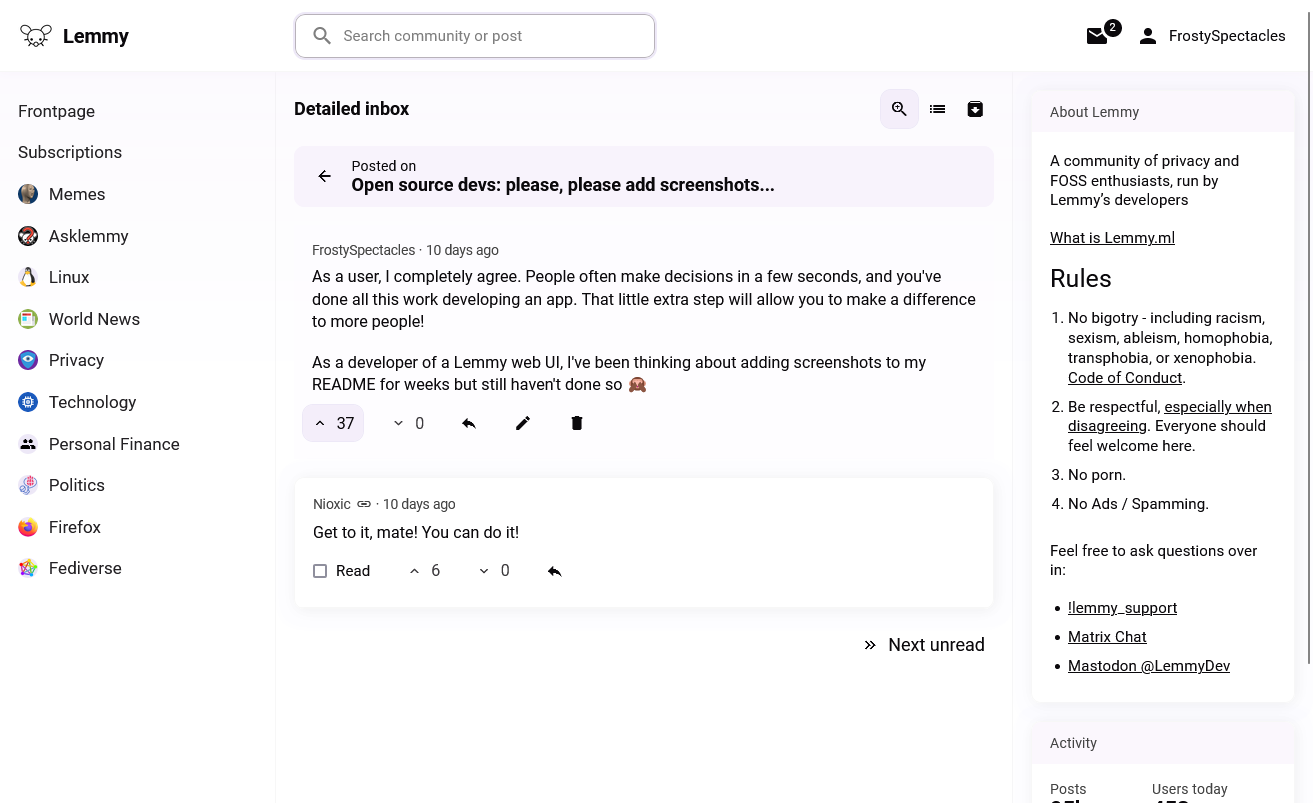
Here’s how I approached it in Lemminator:

All context is right there, and I can work through my unreads one by one. A conventional compact inbox view is also still available:

Would this work for you? Do you prefer the classic inbox?
How does this work? Do you fetch the parent comment ID if it exists? Or does the API provide context?
The former. The comment reply contains a
pathparameter listing the IDs of all its ancestors. I take its direct ancestor and fetch it.
Today I learn about Lemminator, the project seems nice.
Unfortunately, I got an error on https://lemminator.netlify.app/, but I will follow this closely!
What error were you seeing? If it’s unrelated to Lemmy.world downtime, I might be able to help.
Internal error, so probably LW related. Thanks for offering!
I prefer the classic interface since I always click through to the post anyways
Never seen it like this, but I think I prefer it the way it is now. I don’t want my inbox here reading like email, I’m perfectly fine with clicking the comment to go back to the conversation. It also gives you a chance to see if there are further comments below the immediate reply.
this is how kbin does it, i think
i must admit, i can often guess what the context is of a message, and if i reply i usually open the whole thread anyways
what would be really useful however, is something like this for dms. currently the best way is to show read, then go to the messages tab so you’re not swamped. a threaded view of that would be great
if i reply i usually open the whole thread anyways
I’ve noticed on both the official web UI and Thunder that the permalinks don’t always scroll to the right comment. Lemminator only shows the relevant part of the conversation, e.g. https://lemminator.netlify.app/c/lemmyapps/post/3824810/comment/2824106.
i think this is a bug with v0.18.4 - i know it wasn’t happening and then suddenly it was, and i’m pretty sure it was right after the update


